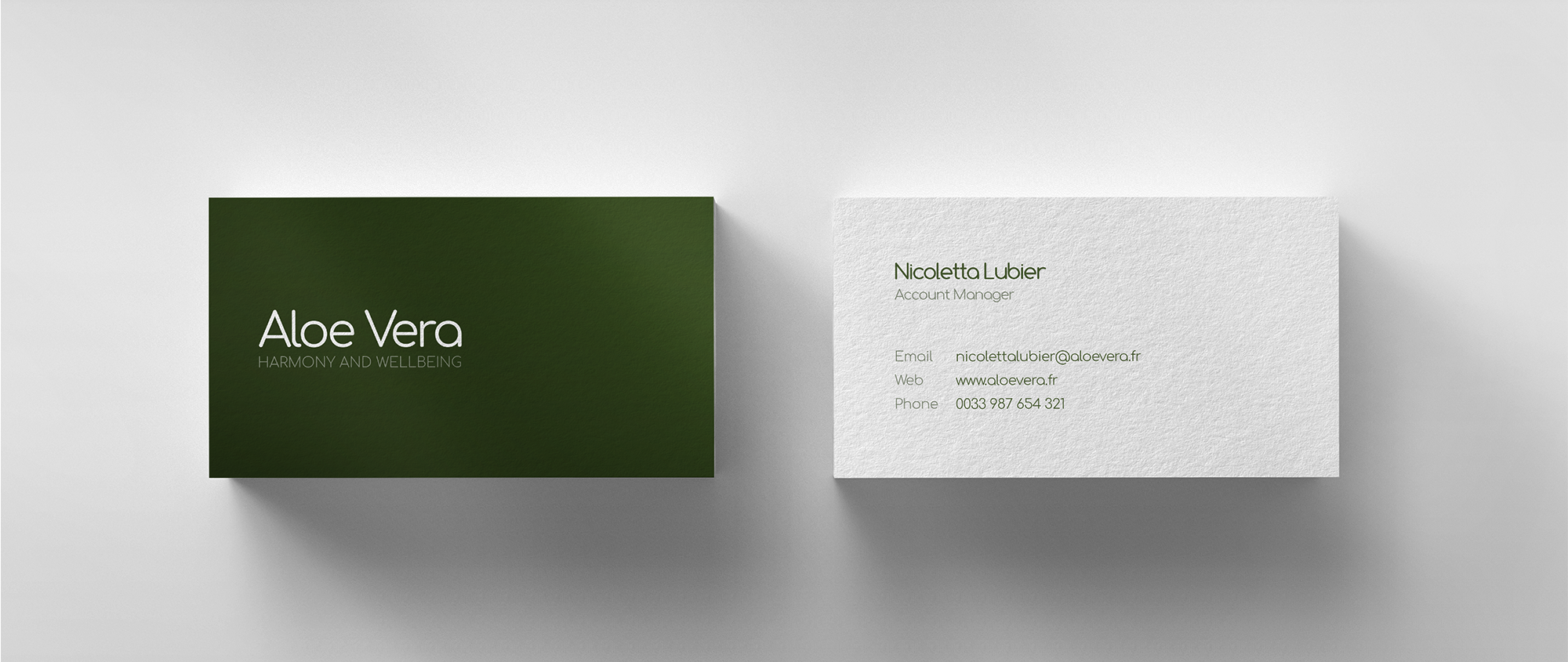
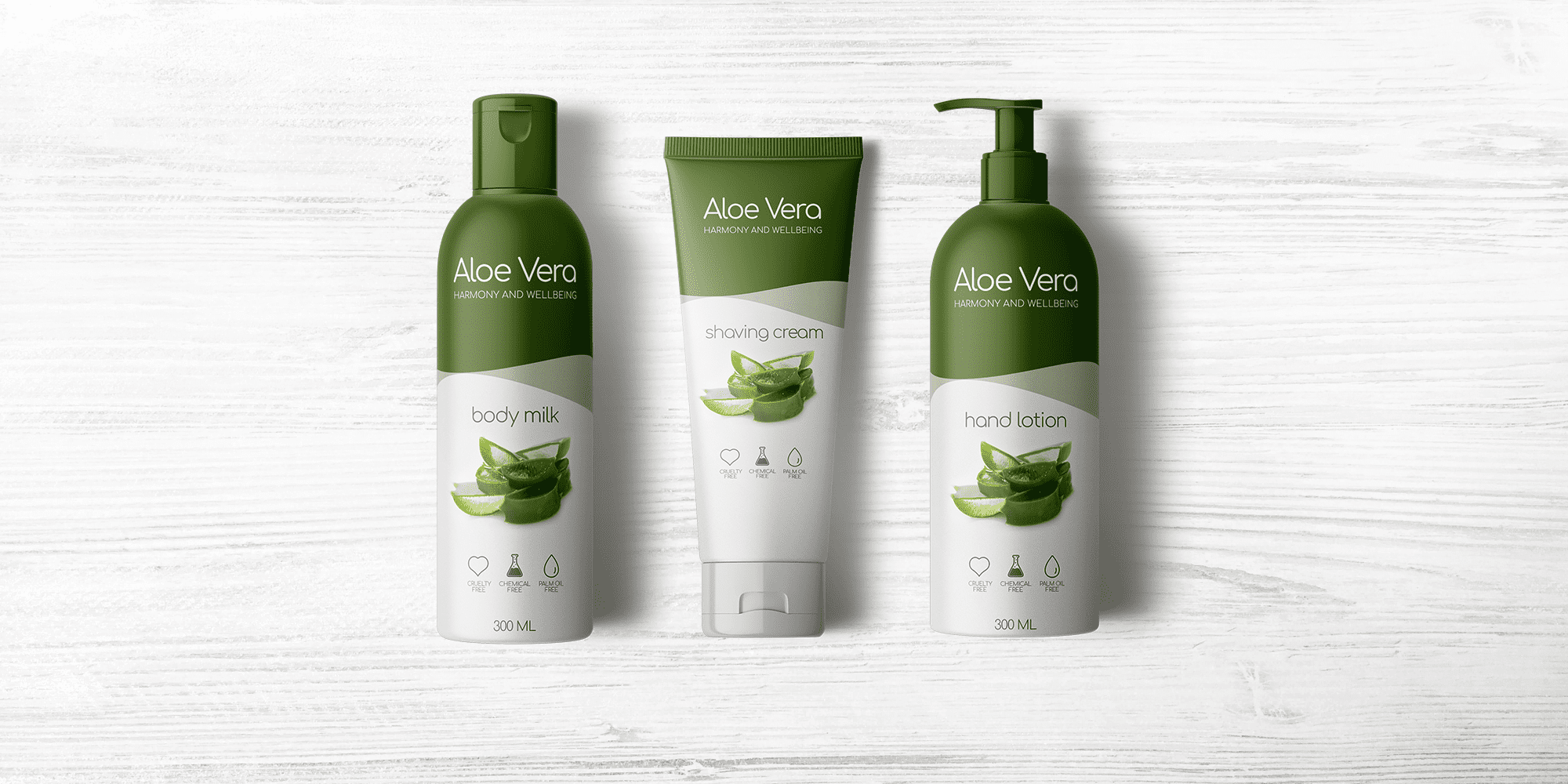
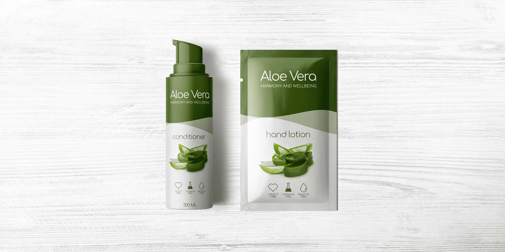
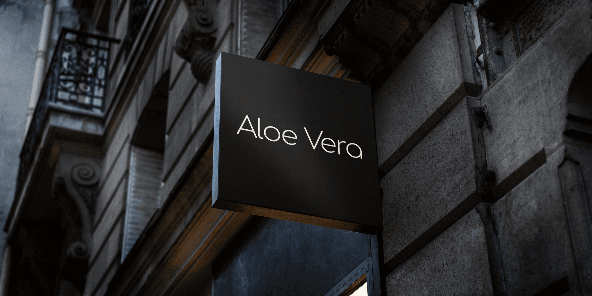
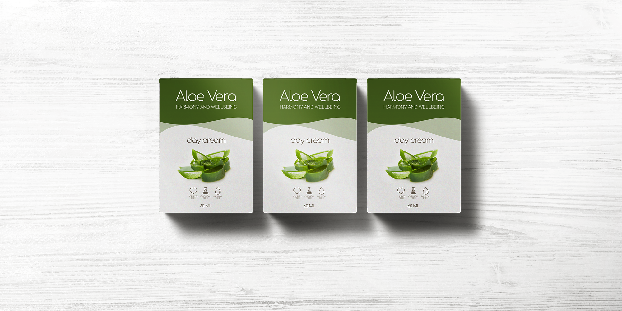
The logo unites traditional typographic elements with new, custom-designed characters, while the dynamic slashes historically signify an abbreviation. This typographic language is supported by a palette of pictograms based on silhouettes of landmarks and products. Appointed to design the new visual identity for marketing and promotions, we sought to communicate Aloe Vera’s distinctive blend of heritage and modernity. The new identity had to reflect the heritage but it also had to be suitable for the brand’s culture and initiatives. Equally important was the clarity and the iconic value of the identity, which would be used by companies and institutes throughout the world, across a diverse range of communications media.
Aloe Vera

Details
Client
Aloe Vera
Skills
Illustrator | Photoshop | Sketch | WordPress
Tools
Slack | Miro | Figma | Confluence | Jira
Items
Brand identity | Brand strategy | Scenography | Signage & Visuals | Concept design | Print
Market & opinion studies | Brand analysis | Product analysis | Web design



Similar case studies.


