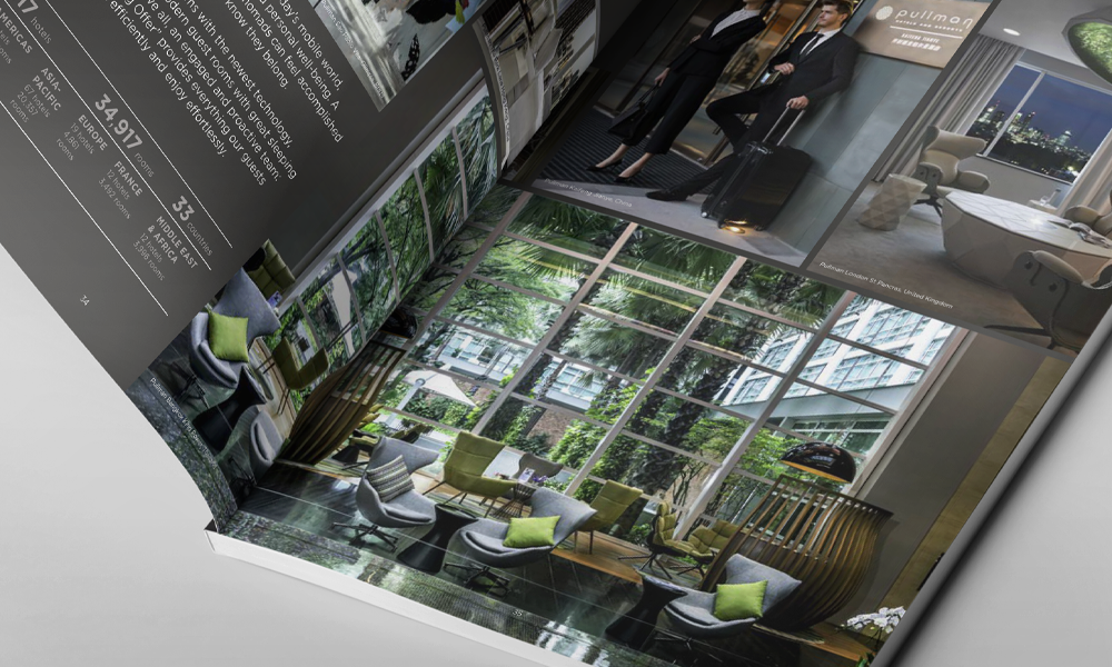
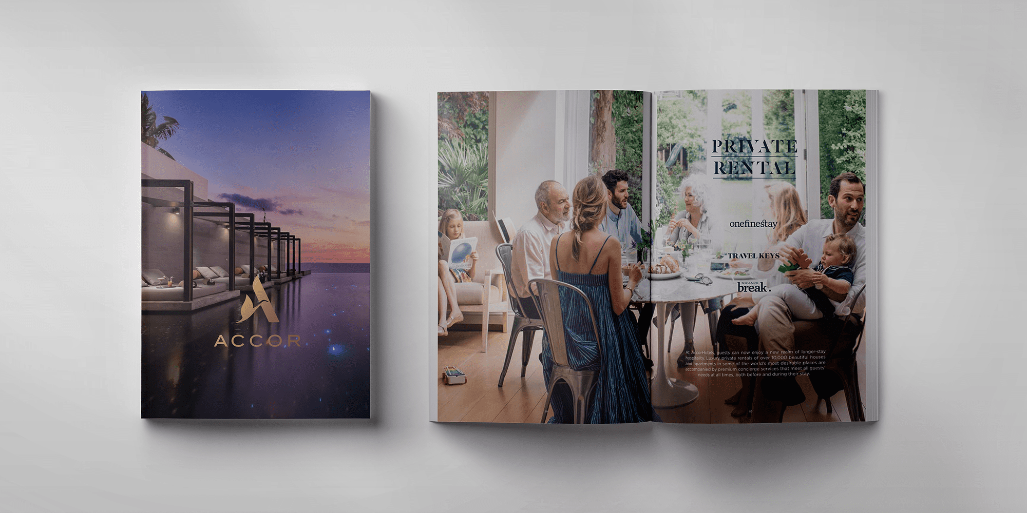
We wanted to retain as much of the existing brand equity as possible. The Accor Hotel logo and colour have achieved widespread recognition and value globally, and should therefore remain untouched. Our strategic focus was to foster growth by creating a more personal, more human image, and by improving the visibility of the brand across the vast range of touchpoints used worldwide. It was equally important to provide the tools required to appeal to specific local markets – whatever the region or country – without losing the ‘one brand’ principle. Having identified consistency as the key we redefined the Accor Hotel magazine identity, designing a clear brand personality and structure to ensure a flexible, yet clearly uniform look and feel across the globe from communications to fleet liveries. We also introduced a new approach to photography, placing the emphasis on people.
Accor Hotels
Details
Client
Accor Hotels
Skills
Illustrator | Photoshop | InDesign
Tools
Slack | Miro | Figma | Confluence | Jira
Items
Converting | Rendering | Signage & Visuals | Print | Magazine design | Digital magazine



Similar case studies.


